Why this onboarding takes eleven screens — and works.
A frame-by-frame look at a recent fintech onboarding flow that breaks every shorthand rule of mobile UX and, somehow, retains better than its three-screen rivals. We walked through it with the team that built it.
The app is a personal-finance product launched by a small UK team in early 2025. It has, by the team's own published figures, about ninety thousand monthly active users in mid-2026. By the standards of contemporary mobile UX writing, the onboarding flow ought to lose somewhere between sixty and seventy per cent of the people who start it. It loses, instead, about thirty-two per cent — which puts it, on the team's internal benchmarks, ahead of every comparable fintech onboarding they have studied.
This is, in our experience as a magazine that has been writing about onboarding for six years, an unusual result. The shorthand rule in mobile UX is that every additional screen in an onboarding flow costs you somewhere between five and fifteen per cent of your potential users. Eleven screens, by that rule, should be a death sentence. The team that built this flow has, by a series of small, considered, and slightly counterintuitive decisions, found a way around the rule.
The decisions are worth looking at in detail, because they suggest that the shorthand rule may be — like most shorthand rules — true on average and unreliable in the specific case.
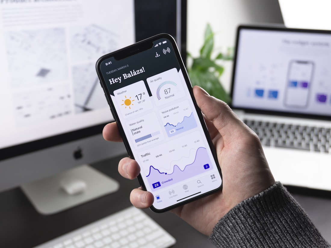
Screen one: a question, not a welcome
The first screen of the flow does not, as the genre convention would suggest, welcome the user, describe the app, or introduce the brand. It asks, in a single sentence, what the user is trying to do. The four options are written in plain English. The user taps one. The tap, the team confirmed in conversation, is recorded as the first event in the onboarding funnel.
This is a significant decision. The conventional first screen is a description of the app, with a "Get Started" button at the bottom. The "Get Started" button is the most-tapped element in most onboarding flows. The team's hypothesis was that replacing it with a real question — one whose answer would shape the rest of the flow — would do two things: signal to the user that the app was going to listen to them, and give the team useful segmentation data from the first interaction. Both, by the metrics they shared with us, turned out to be true.
Screens two through four: branching, by intent
The user's answer on screen one determines what happens on screens two through four. The four answers branch into four sub-flows, each of which asks two or three short questions specific to the intent the user has expressed. The questions are, again, in plain English; none of them takes more than a few seconds to answer.
This is the part of the flow that, on paper, ought to feel longest. In practice, it feels short. The team's user-testing footage, which they let us watch on a laptop in their office, makes the reason clear: users who have already declared their intent on screen one are, on screens two through four, answering questions that feel relevant to them. The questions are not asking the user to provide arbitrary data. They are asking the user to clarify the intent they have already chosen to engage with.
"The screens that feel long are the screens where the user can't see why they are being asked. If you can make the user feel that every screen is shaping the product around them, the flow can be twice as long and still feel shorter."
Screen five: the explicit summary
Screen five does something I have not seen in any other onboarding flow. It shows the user, in plain language, what the previous four screens told the team. "You are trying to do X. You have told us Y and Z. We are going to set up the app for that."
The screen has a single "Continue" button. It also has a small, subtle "Edit" link that the user can tap to go back and revise any of their previous answers. The team's data shows that the Edit link is tapped on roughly four per cent of sessions, which is to say almost never. What the screen does, primarily, is reassure the user that the previous four screens were not arbitrary friction. The data they provided is being put to use.
Screens six and seven: the account
Screens six and seven are the account-creation flow. By this point in the onboarding, the user has spent perhaps ninety seconds in the app, has expressed an intent, has answered several follow-up questions, and has been told that the answers will be used to configure the product. The motivation to actually create an account is, by this point in the flow, considerably higher than it would be on a conventional "create an account" screen at the start.
The team's data on this is striking. On their previous flow — a more conventional five-screen onboarding with account creation on screen one — about forty per cent of users dropped out at the account-creation step. On the current flow, with account creation on screens six and seven, the drop-out rate at this step is about eleven per cent.
Screens eight through ten: the product setup
Screens eight through ten do the actual configuration work. They are, in functional terms, the parts of the onboarding where the user is doing the things that will let them use the app: linking an account, granting a permission, choosing a few preferences. These screens, in a more conventional flow, would typically be after the user has been dumped into the app's main interface — at which point a significant fraction of users never actually complete the setup.
By integrating the setup into the onboarding flow, the team has made these steps feel like part of the same coherent process as the questions earlier in the flow. The user, having declared an intent and watched the app respond to it, is willing to do the work of actually getting set up. The completion rate on these three screens, the team told us, is around eighty-eight per cent. On the previous flow, with setup deferred until after onboarding, the equivalent completion rate was around fifty-two per cent over the first seven days.
Screen eleven: the first action
The final screen of the onboarding is not, as you might expect, a "you're all set" celebration. It is the user's first useful action in the app — a real screen of the main product, pre-populated with content shaped by everything the user told the onboarding flow. The user is not, at this point, "entering the app." They are, by the deliberate design of the flow, already in it.
The transition is, in the team's view, the single most important moment in the entire onboarding sequence. Conventional onboardings end with a "welcome" screen and a button that takes the user into a blank main interface. The team's research suggested that the blank main interface is, for many users, the point at which the onboarding's promise of personalization stops being delivered on. By making the main interface — already personalized — be the eleventh screen of the onboarding, the team eliminates the gap.
What this flow does not do
I want to be careful to note what this flow does not do, because there is a tendency in onboarding writing to overgeneralize from single successful examples.
The flow does not work because it is long. It works because every screen in it is doing a specific job that the user can feel doing work. An equally long flow, with the same eleven screens in the same order, but with screens written less carefully and with questions that did not feel relevant, would lose users at the conventional rate or worse.
The flow does not work for every product. It works for a product where the user comes in with a clear intent and where the product can be meaningfully shaped by understanding that intent. A product whose value is the same for every user, regardless of intent, would not benefit from a flow of this kind.
The flow took, the team told us, about four months to design, test, iterate, and ship. The previous flow had taken about three weeks. The decision to invest the extra effort was made on the basis of a calculation about lifetime value: a user who completes the onboarding has, by the team's data, an order of magnitude higher chance of becoming a long-term active user than one who does not. Twelve weeks of design work pays for itself, on those numbers, in about six weeks of normal acquisition spend.
What we are taking from this
The single thing I will be repeating, after this teardown, is that "shorter is better" in onboarding is true on average and unreliable in the specific case. The genuine question is not how many screens are in the flow but whether each screen feels, to the user, like work that the app is doing on their behalf. Eleven screens that each feel useful will outperform three screens that each feel like friction. We have, in our six years of writing about onboarding, seen many examples in both directions. This is, however, one of the clearest.